Authors: Shaun Russell and Petra Wille
KPI trees are a tool that can help you foster alignment, transparency, and focus in your product organization. In this post, we’ll walk you through what KPI trees are, how they work, and how to set one up for your own teams.
Table of Contents
Since this post is quite lengthy and detailed, we’ve broken it down into smaller chapters. Feel free to read it from beginning to end or skip to the parts that you’re most interested in.
Introduction: what are KPI trees (and why should you care)?
Meet our heroine: Maxine
Some key points to keep in mind
Deep Dive: the two ways to grow a KPI tree
How to build and maintain your own KPI tree
Advanced stuff
Common pitfalls
Putting it all together
Further reading
Introduction: what are KPI trees (and why should you care)?
If you’re a product leader, it’s likely that you’re searching for tools to help you foster alignment, transparency, and focus in your product organization. Maybe you want your team to work in a more customer-centric manner. Or, perhaps you believe product metrics could be valuable to your company, but you don’t yet know how to use them properly.
If any of this sounds like you, KPI trees might be the answer. KPI trees can help you with:
Alignment across teams, by bridging the gap between customer behaviour, product metrics, and company goals
Understanding whether you’re making progress toward your strategy, tracking the right things, and making connections between what you’re tracking and your strategy
Coaching your PMs to understand metrics and see the big picture of their work
How does it work? A KPI tree shows the relationship between the important metrics in a business, from the overall goal down to all the metrics that influence it.
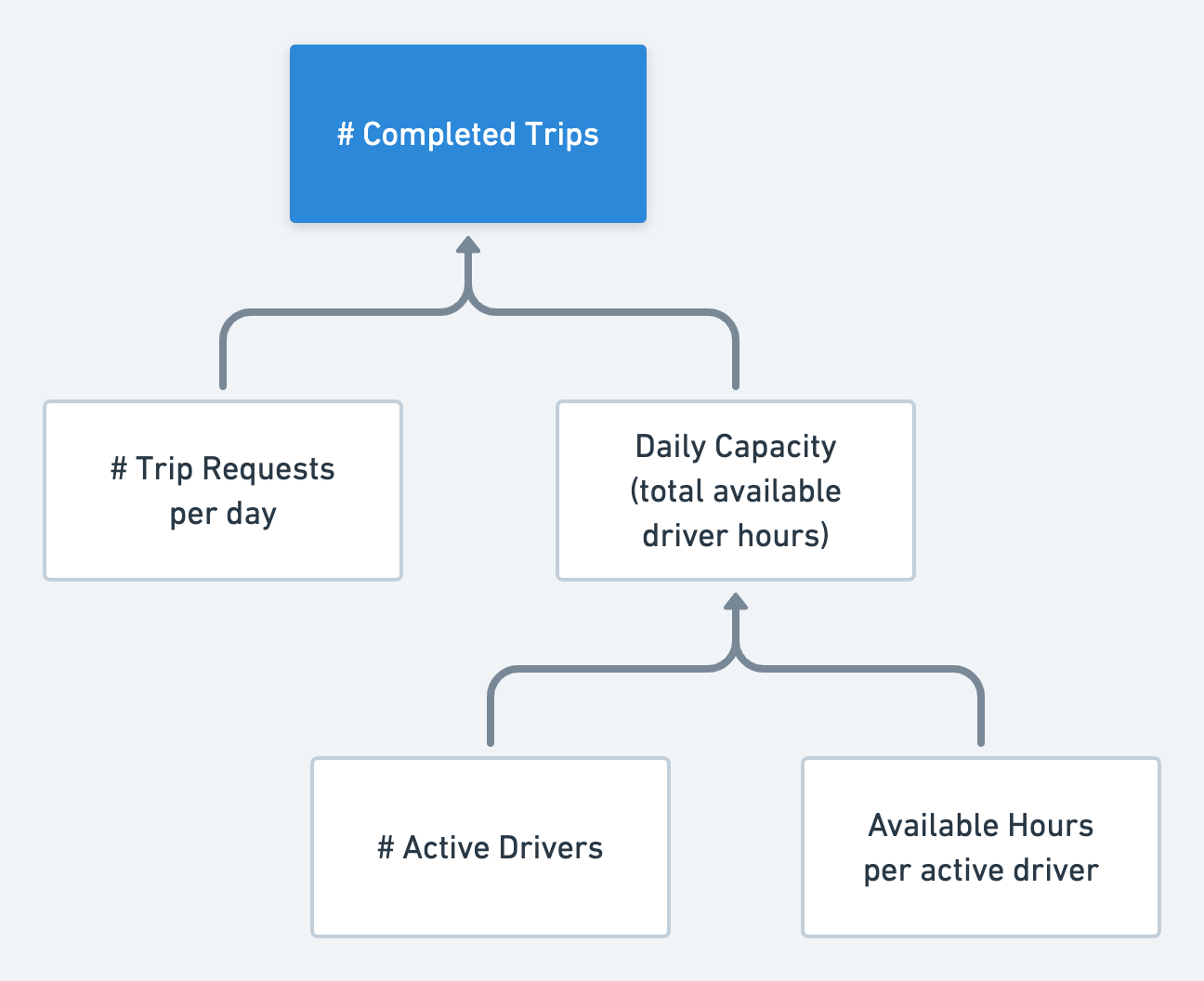
A KPI tree showing the metrics driving the overall goal, completed trips
In the simple example above, we imagine the KPI tree for a ridesharing app like Uber or Lyft. At the top, you can see the overarching goal, # Completed Trips.
By following the branches down, you can see which metrics contribute towards this goal. In the first layer down, you could contribute towards more completed trips by increasing # Trip Requests per day or the Daily Capacity (total available driver hours). Going further to the next layer, you can see that Daily Capacity is itself driven by two further metrics, # Active Drivers and Available Hours per active driver.
In this way, everyone in the company can see the metrics they can work on in order to reach the overall goal, and how they are all connected.
Meet our heroine: Maxine
To explore the concept of KPI trees, we’re going to use a hypothetical example. Meet Maxine, a head of product at an old fart news channel, Yesterday’s News. Her company wants to grow their audience of younger viewers/listeners. They decide to make a bet on an app that delivers fresh news audio from trendy journalists, which is the product Maxine is responsible for.
Maxine and her team started working on this app three months ago. They already have a dashboard that collects all the metrics they’re tracking. It’s a bit of a mess because they never deliberately chose any KPIs; they’re just tracking nearly every event that occurs in the app.
Maxine reached the conclusion that the team needs to identify the most important KPIs. To do that in a structured way, she proposed that they make their own KPI tree. To get started, Maxine called a meeting with the product team and other relevant stakeholders (including Marketing and Business Intelligence).
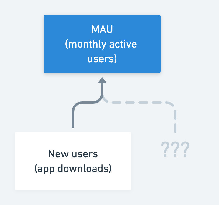
When first developing the app, the team had focused on acquiring new users. But when they met to discuss what should go in the tree, they realised that new users wasn’t their most important goal. Instead, they agreed on monthly active users (MAU) as their number one goal. So MAU sits at the top of the tree, and new users is one piece of the equation that leads to it.
The beginning of the KPI Tree, with MAU as the overarching goal
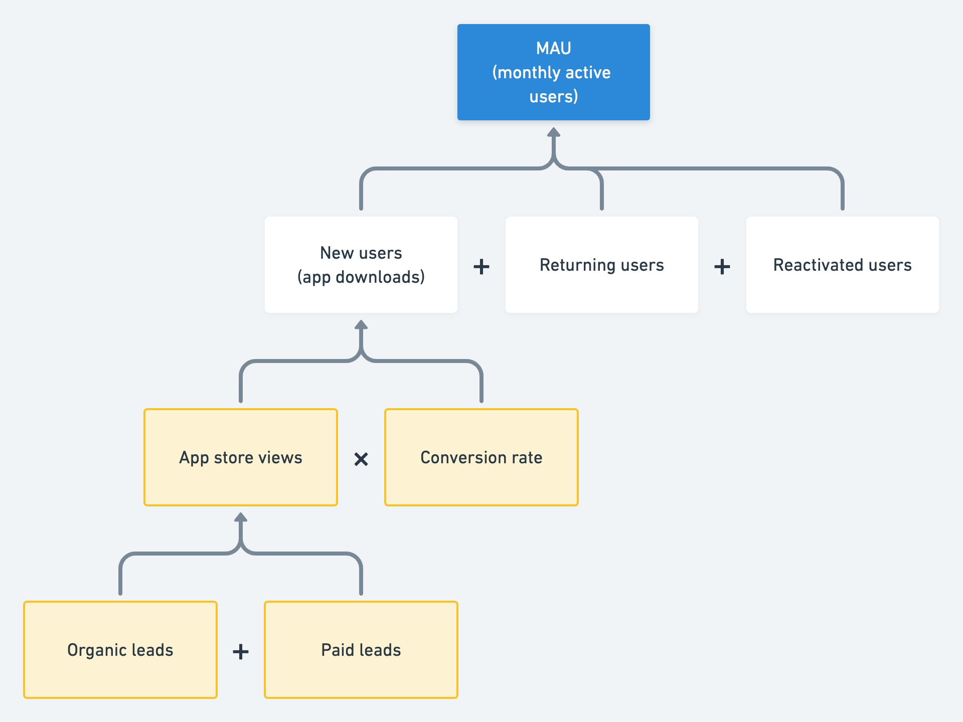
Through their discussions with the other teams, they also identified other branches that lead to MAU: returning and reactivated users. They thought of these branches like an equation:
MAU = new users + returning users + reactivated users This is an important lesson: If you’re stuck, it helps to think of your problem as a math equation. Start with one metric and then think of everything else that leads into it.
Expanding the tree to include the different user segments
Since new users is an important metric for them, they wanted to break this down into several other KPIs. The marketing folks were able to break new users down into several other KPIs related to acquisition, like app store views, and organic and paid leads. This is a good example of how invaluable input from people outside the product team can be.
Breaking new users down into more specific metrics
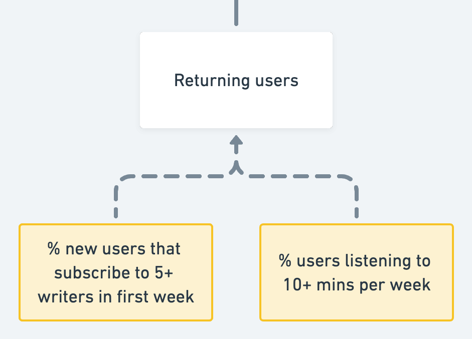
Retention, however, was much harder to break down. So they conducted user research: they spent time listening to users to understand which outcomes (behaviors) made them likely to return. But they’re still learning about the relationship, which is why the KPIs related to retention are indicated with dotted lines: these are hypotheses.
Adding their new hypotheses to the returning users branch
Now that they had broken down their priority metrics (new users and returning users), they agreed that the first iteration of their KPI tree was complete, and ready to use.
The completed KPI tree
Some key points to keep in mind
Why was it important for Maxine and her team to create this KPI tree? Here are a few reasons:
The team now has a clear idea of success and can measure progress in a meaningful way.
They can update the dashboard so that instead of measuring everything, it will now reflect what is in the tree. The dashboard will now provide a better overview of their work while being more relevant and actionable.
Since the KPI tree is a shared document between departments (news, marketing, product, etc.), it forces them to make decisions under the same terms. The tree is a reference point for conversations between departments and with different stakeholders. A well-built tree means all these discussions will become more outcome oriented.
And what has this example taught us, the KPI tree newbies? We’d like to point out a few observations:
It’s completely expected and normal for your tree to grow over time as you learn.
It’s essential to include others in the discussion and get their help in building the tree. We mentioned earlier how the marketing folks helped break MAU down into more components.
If you ever get stuck when building your tree, you can take a mathematical approach, or a more research-driven approach. Both are valid, and both are important. That's what we'll talk about next.
Deep Dive: the two ways to grow a KPI tree
Let’s return to our example KPI tree. We’re going to deep dive into two branches, New Users and Returning Users. That’s because they demonstrate the two main ways of growing your tree: mathematical relationships and hypotheses.
We’ll start with the new users branch, which shows mathematical relationships in action. We saw this already at the very top of the tree. The New Users branch continues this method further down, with the following equations:
# New users = # Leads × % Conversion rate # Leads = # Organic leads + # Paid leadsAs you can see below, these are reflected in the tree. You will also notice the mathematical symbols added between branches. This is to make this relationship as explicit as possible to someone viewing the tree:
Mathematical symbols highlight the equations in the tree
Where do these equations come from? In our hypothetical example, it was thanks to the expert input of the Marketing team. But you’re probably also familiar with useful equations from your own work:
If you’ve ever composed a business case, you used equations to connect variables
If you’ve conceptualized your product, marketing, or sales as a funnel, you used an equation to break down overall success into individual steps (a popular example of this is Pirate Metrics)
If you’ve segmented your customers, your segments each add up to the whole, like an equation
In short, wherever there is an equation to be found, there is a valid way to break down your tree.
But that’s not the only way to break down your tree. You can also use hypotheses, which we see in action in the returning users branch:
Hypotheses indicated with dotted lines
These metrics are connected in an imprecise way. Their relationship is a hypothesis.
As shown here, we recommend using dotted lines to show hypotheses in your tree. This is a simple way to visualize that the connections are less reliable and subject to change. As a tree evolves, you may validate the metric hypothesis (through experimentation or observation), or replace it with something better.
In our example, we said the Product team conducted user research to arrive at these hypotheses. Here are just a few possible techniques that they may have employed:
Interviewed users to understand why they might return or churn
Created a Customer Journey map (Journey-Mapping Approaches)
Used their product usage data to identify possible activation moments (How To Discover Your App’s Aha Moment)
In summary, a KPI tree has two types of connection: mathematical relationships and hypotheses. Master finding them both, and you can master making a tree of your own.
How to build and maintain your own KPI tree
Let’s state the obvious: If you want to build your own KPI tree, you need to start from somewhere. If there is an obvious top-of-the-tree metric, like a North Star metric, start there. However, if you don’t yet have a clear top of the tree, start from what you do have: for example, customer metrics and other business goals.
Once you’ve nailed down at least one KPI, you can continue to populate the tree. Keep in mind this will be a messy process and you will almost certainly need to revise and refine your tree over time.
Get all your ideas onto a whiteboard (physical or virtual—either works! We have used tools like Miro, Mural and Whimsical). Put the metrics you have on Post-its and do a whiteboard session to discuss hierarchy and weight.
When you’re stuck, you can think about growing your tree by thinking about mathematical relationships or hypotheses as described in the previous section.
Once you’ve started filling out your tree, take time to reflect and ensure there are no overlaps or gaps between branches, where possible.
As you’re building out the branches of the tree, you’ll also want to add lines and arrows to indicate the relationships between different parts of the tree. We suggest the following:
An arrow means that one metric contributes to the other metric. This means that all your arrows should be pointing upwards... unless you are looking at your KPI tree upside down! ;)
Use a dotted line if you have a hypothesis but you need to learn more about the connection to verify if the correlation exists.
Use a solid line if you are certain that one KPI influences or drives another KPI in a particular way.
Remember that building your KPI tree is not a one-off event. You will need to regularly review and revise it. Here are our tips for maintaining your tree.
Not sure when to review your tree? Make sure to do so any time your strategy changes, your goals or objective change, you make a bigger discovery revelation, or when you find something in your tree is wrong (particularly with metrics that are a hypothesis).
Even if none of the situations above happen, make sure you create a regular checkpoint to revisit your tree, e.g. once a quarter.
The process for reviewing your tree is similar to what we’ve described above. Find somewhere to start, and then review the branches and relationships section by section.
Advanced stuff
Once you’ve built up your confidence in the basics of creating and maintaining your KPI tree, you’re ready for the advanced stuff. Here are a few of our suggestions.
Use color coding
You can choose different colors to signify the level of confidence or solidity of each metric. This can be as simple or nuanced as you’d like. A few possibilities to consider:
Is the metric trusted and available for self service? (e.g. can you look it up on a dashboard whenever you want?)
Is the metric verified but not available for self service? (e.g. it’s reliable but you need someone else to look it up for you)
Is the metric not tracked or not available?
Is the metric unverified or unreliable?
Vary the line thickness
You can also use different line thickness to indicate information. For example:
Use the thickness of the box outline to indicate which metrics are the “next to be worked on.” This could mean you need to verify or implement tracking or make these metrics go from available on demand to self-service.
Use the thickness of the arrow lines to indicate the strength of the relationship between metrics. The thicker the line, the more the metric contributes.
Common pitfalls
Now that you’ve got a sense of how KPI trees work, let’s consider a few of the common pitfalls to avoid.
Not asking for feedback
As we saw from the example with Maxine, stakeholders from other teams can help you refine your KPI tree and better understand the relationships between components. Make sure you share early drafts of your tree and regularly ask for feedback.
Not indicating your key hypotheses
Not everything that goes on your tree will be verified—it’s likely to include a few hypotheses. Make sure you find a way to indicate these, either with dotted lines or something more specific. Refer back to the “Advanced stuff” section for some ideas on how to do this!
Making your tree too big
Decide which parts of the tree need more detail. In our example with Maxine, they didn’t break down the ‘reactivated users’ branch further, as they did not yet see it as a focus area. When presenting a KPI tree, it is also common to hide branches that are no longer in focus or less relevant to that specific discussion. You might also want to create a top-level tree that captures the whole product landscape and allow teams or initiatives to go into more detail in specific branches.
Putting it all together
In summary, KPI trees are a great tool for alignment. They can help your organization highlight the connection between customer behaviour, product metrics, and company goals. This sets the foundation for understanding strategy in terms of what you measure and ensures you are tracking the right things.
Start making your own tree by getting things on the (virtual) whiteboard! Put your metrics on Post-its, and have a whiteboard session with them, to explore how they are connected. Then, link metrics using solid lines for known connections and dotted lines for relationships which you want to learn more about.
Give it a try and let us know how it goes!
— Shaun and Petra
Further reading
If you’re just starting on your KPI journey, you may wish to dig deeper into some of the topics we’ve mentioned in this post. Here are some articles that we recommend.
MECE Principle to avoid trees with gaps or overlaps
Outcomes Over Output: Why Customer Behavior is the Key Metric for Business Success (book)


